Sunday, August 23, 2020

Manila envelop journal #1- Pretty Bird


This pretty little journal was created from a green hanging file folder, 2 8.5 X 11 manila envelopes and some pretty bird napkins.  


First I joined the manila envelopes together.  To add a bit more interest to the fold-able I also opened then end of the left hand envelope and cut a thumb hole.  


You can see here that the right hand envelop has opening on both sides.  I covered both with white gesso and rubbed them with vintage photo distress ink to give an aged look before cutting and decoupaging the napkins to the spread.   

As per usual, I didn't photograph the process so I will talk you though it in the  following video.  I will leave the posted pictures if you desire a closer peek.  


Sunday, April 15, 2018

Fitting some color therapy into my busy weekend.


Color Therapy 101


It was a busy weekend....Jamie and Lizz were home for a few days, contractor arrived early Saturday morning to measure windows for an estimate / replacement, Saturday evening with friends after the usual afternoon of house cleaning, painted kitchen woodwork and spent Sunday afternoon raking the lawns and picking up the multitude of fallen branches that have accumulated over the winter.

To add insult to injury, I was too tired to make a proper Sunday evening meal and opted for chicken strips.  I now feel stiff, sore  and nauseous....Why do we do things we know we will regret????

But, in between the weekends many tasks, I did stop here and there and worked on my altered magazine journal.  Color therapy is good for what ails you.  I steal a peek of my book when I first get up in the morning and seeing all the colors and pretty pages sets the day.  I just love color and texture.

I have tried hard to continue to include both a before and after picture.....so shall we have a look?


This was the page that I started last weekend and shared with you.   


I added a focal point from my stash and a few pieces taken from other parts of this magazine.  I just love the wooden duck which was handcrafted in Newfoundland and taken from a copy of Saltscapes magazine.


     This spread I also started last week but didn't know where I was going to go with it.


Finished spread.  

This is the back cover of magazine 1 and the front cover of magazine 2.....glued together.  It created a very thick page to work on.  Yeah!!


These graphics were taken from three different pages in the magazine ....I  thought they looked so much better together.


Another two pages spread with not much happening......I did like the mixed-media inspiration heading, the "Her Heart Told her....." and the angels in the corner so I tried to incorporate them somehow. 


If you look closely you can see the original bits peeking through the marigold acrylic paint.  They show up better in the book than can be seen it this picture.  The focal point was from my stash and the fussy cut butterflies from a sheet of craft paper.  The velum quote was purchased years ago....no idea from where.  I love being able to use stuff that has been in the art cupboard collecting dust.


Not much inspiration for this page.....
so paint one side out and see what we can find to spruce it up.


I found another velum quote and a cute little girl with paper wings from my stash.  I think she was from an older Stampington and Company magazine....not sure though.


I LOVE LOVE LOVE Altered paint brushes.
 Perhaps it's because I never seem to clean them properly and they all end up stiff and ruined.
Well no more....embellish and layer on the bling!!
I first saw altered brushes on a Donna Downey video.....she had them displayed in her new house.  Gorgeous!


This is actually a two and a half page spread......I fussy cut the three pieces.  
"See possibility Everywhere," even in an old paint dried brush. 
 LOVE IT!!


I need to go back and paint out the back of the 1/2 page.....I want to make sure everything else is 100% dry first.


I loved the colors on this page....and wanted to continue the images in full on the left hand side.It took some doing but with a piece of cheese cloth I was able to get the same paint texture going......it tuned out a little darker than I wanted, but I am OK with that.


"Lucky is a State of Mind"
Indeed.  


The end is in sight for my first altered magazine journal; 10 or so pages to go.   

 I cringe when I think about all the Martha Stewart and Country Living magazines I threw out a year or so ago.....I have a major purge every few years....it feels good until the day comes when you say.....and you will say it...."I wish I had kept......".  I think I had 5-6 years of M.S. mags and at least 2-3 of C.L.  Oh, the focal points that I could have had.  

Well, that's all for this Sunday evening.  I am off to bed in hopes I feel better in the morning.
I hope you enjoyed my weekend of color therapy....I know I did. πŸ™‚πŸ™‚

Sunday, April 8, 2018

A magazine journal mishap, resurrection and moving on.


Remember this lady from my last posting.  I thought I was raising the artistic bar by incorporating raised images in this magazine journal......bad idea. Not only did it cause the spine to swell and twist, pages began to separate.  What a friggen mess.  Time to go to plan B.  


Plan B 


My thought was this spread had to go onto a firmer substrate.....
So I considered my sheets of 100 pound water color paper. 
 Nope.  Not large enough.
A back off a cereal box....blah.
A page of my huge altered cookbook journal.  
Just the thing. 
 So I set about laying the underpants using two sheets of vintage sheet music from my stash.... this paper was so old it almost crumbled when I ripped it into pieces.  So I added some not as old music paper from an old piano lesson book.  


Much better.  
I named this one "Hope is never lost".
  It was fitting as my first thought was to toss her in the bin.  

This save made me so happy that I sped off altering more pages, and guess what?  I forgot to take my before pictures.  Bugger!😑

So here they are.  


This page was damaged by the above mentioned twisting and ripping, so I seamed the pages back together with my good old sewing pattern paper.  Have I said often enough just how much I love using that paper?  What a nice golden texture it creates. 


This page had a lot of text to cover and I need to admit, at this point I have started to shy away from using paint for page coverage  in case it continues to make the papers separate from the spine....so more sewing machine paper.  For this spread  I decided on the placement of a storage pocket as these pages will not be able to used for journal writing.....I will place some decorative tags in the pocket to be used for that purpose.  


Named:  Find joy in the ordinary.


This page was also just holding on....so I bound the two pages together with a strip of cheese cloth and Mod Podge.  I also created a pocket on the left side instead of painting out the text completely.  I applied a thin layer of acrylic paint and rubbed the edges with Distress Ink.  


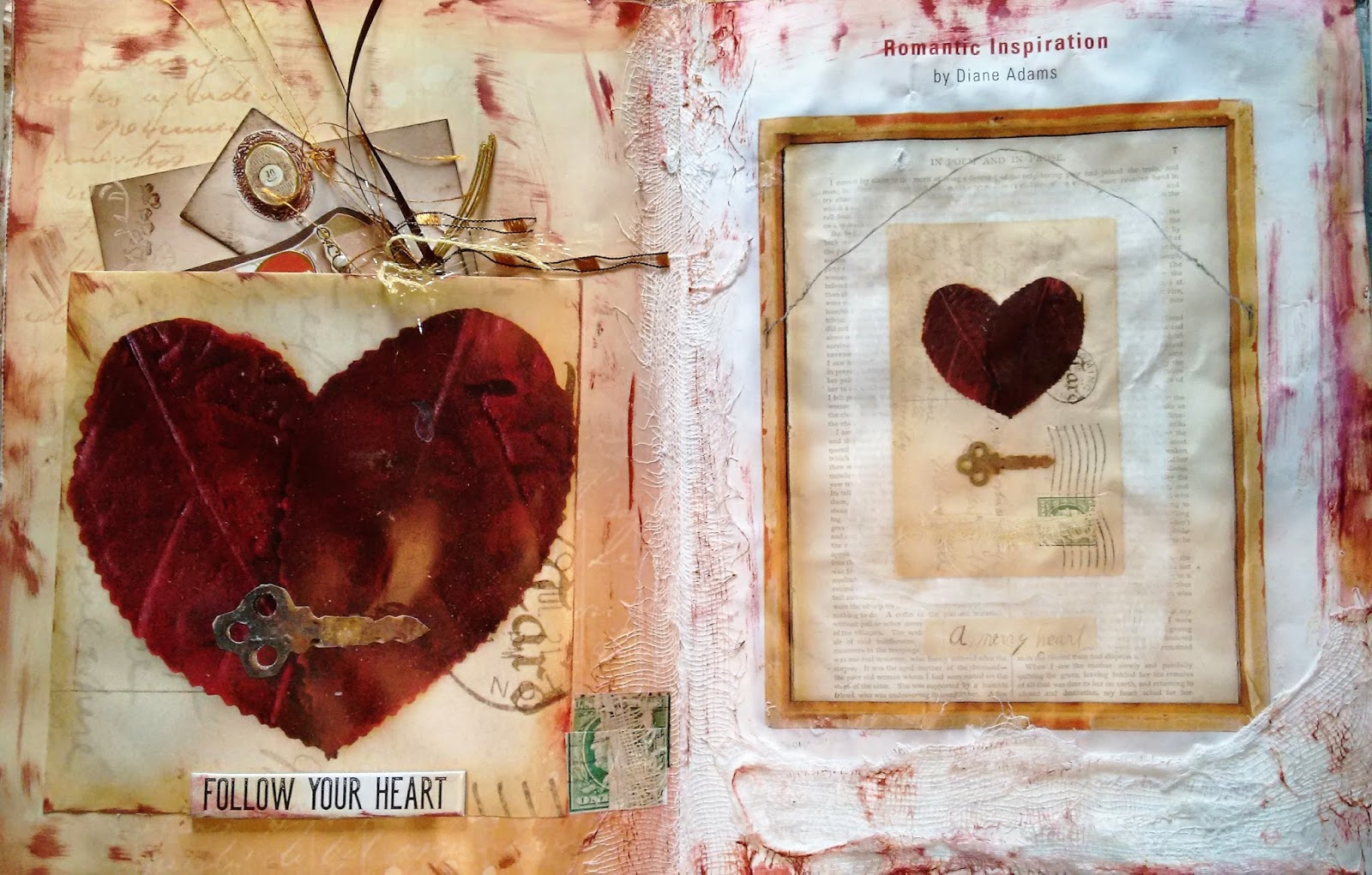
This "Follow your heart" spread comes with a ready made Valentine to share with your sweetie.  
How nice!


 This page was a challenge at first.  All it was was text with black and brown paint smudged on it.....what the heck?  So I chose the path of least resistance and grabbed my black paint pot and labeled the spread "Lost".  Seems fitting to me.


This spread was fun.  I painted out the text on the right with silver acrylic and while it was still wet wiped turquoise paint over the entire page with the very wet paint brush.  Once it was dry I added the little picture of stone in the upper left hand corner.  This  was from the tale of contents for the magazine.  The large pendant on the bottom right that was from my stash "from who knows where."  The word "hallelujah" was trimmed from the left side picture.  I then sprayed both pages with a turquoise spray and then the focal image with a clear texture spray.  If you run your hand across the page it feels like the stones and flowers have a light covering of sand on them. To add a little bling, I added half pearls to the pendants, blue half pearls to the flowers, and a blue flower shaped stone to the pendant at the top of the focal image.  
Very happy with how this turned out.😘


Then a brain wave hit me.......why not take pictures of all the pages that are left in the magazine so I won't forget next time.  Why didn't I think of this before.  
Grrrrrr.  πŸ˜–πŸ˜This menopausal brain is annoying.  
So moving on......these are the other pages that I worked on between painting my kitchen cupboards and going out for coffee and a quick shop with my mom this Sunday- with before and in progress pictures, as I feel I will be coming back to these ones in the next few days.


The text was painted out with antique white acrylic paint.

 And I added two pictures from the "Facial Recognition" spread from the same magazine.  They blended in quite nicely I think.  I have yet to Stabilo the edges of this page....not sure what else might happen before I am through.


 Lots of text here that needed to be painted out.  Three thin layers of antique white acrylic did the job.
I am starting to feel comfortable using paint on these pages again.  I am being extra careful to use multiple thin layers and drying each layer before proceeding.  It seems to be working.


I over laid two of the images with larger versions found earlier in the magazine.....and I continued with the circles found in the original images using a wine cork and Distress Inks.  Not finished yet, but will have to think where I want to go with this one.


Another busy text page, but I like the colors used in the two images.  I am sure I will be adding more colors as the process continues....lots of bright yellow and purple.  It should be a fun page.  


More to come when I get a chance to go back to my table and play.😊


Tuesday, April 3, 2018

Burnished balsa wood container.....My Hobbit Case

Last night I played a bit with my duct tape and a balsa wood container that was purchased from the Dollar Store years ago and has been sitting on my shelf awaiting it's fate.  It is a flimsy odd shaped thing so it was felt that if this project was an utter failure I could just toss it in the bin. 


This is what I started with......


Not sure which direction I want this to sit, but I did cut off the elastic tie that secures the lid shut.  I will deal with a closure afterwards.  


 I decided to put legs on it and sit it in this direction.  The top is very fragile so I will have to be very gentle during the burnishing process.  Fingers crossed.


After burnishing I applied black paint, wiped it off, and  added dabs of turquoise and metallic red rust here and there.  There is also a strip of lace on the front which gives the impression of tree bark.  Now that I look at, the finished product  looks like a log.....so perhaps it is a  piece of furniture from a Hobbit Hole.  Note the few  turquoise stones and crystals placed on the lid and on the sides.  A Hobbit would like those additions.


A closer look at the top with its buttons, bottle cap, bolt, and wing nut.  There is also one side of a zipper that goes along on edge and a chain in an S form. Lots of bits and pieces that I found scattered on my hubby's work bench.  I am sure he won't miss them.  


Can you see the Ladybug?  The mini clothespin?


And its underpants were composed of old music paper, text and some sewing pattern paper....I must have sewing pattern paper...I love that stuff.  

A fun little project.  What's next?